The visual shortcuts your brand needs
Build Mode™ Issue 11.2025
Hello and welcome to this issue of Build Mode, a monthly update with brand insights to help you level up your business. We have an ambitious group of professionals working in real estate, architecture, engineering, construction, marketing, design, and development. You all inspire me to keep sharing, so thank you for being here.
Haven’t subscribed yet? Consider joining us and get the next issue delivered straight to your inbox on the first of the month.
When my son Felix was a bit younger, we would play this game, trying to identify the brands of oncoming vehicles as soon as we could see the logo on the grille.
It meant squinting and straining until the vehicle was close enough that we could actually make out the symbol (and he’s got 20/20 vision, so he’d generally win once he recognized all the logos).
But one time, I beat him by a mile, even with my poor eyesight.
Not by identifying the logo, but by noticing the distinct shape of the headlights, unlike any other vehicle brand on the market — with their vertically oriented, stadium shapes.
And this is what I want to talk about today…
Brand recognition.
Not through logos, but through everything except the logo.
And let’s see if we can have some fun with it! This entire article won’t mention a single brand by name or include a logo in any of the images, but, I bet you’ll recognize most, if not all, of these brands.
Try to identify the brands as you read, then see how you did by checking the answers at the bottom of the page.
Let’s play!

What are brand staples?
I love logos, especially when they’re full of meaning and symbolism in an iconic, compact form. But there are other things, beyond the logo, that can become key identifiers of a brand — things that remain constant, even as everything around the brand evolves (logos included).
Some brands can be recognized without ever showing their logo — through color, shape, pattern, type, or illustration. You see these visual elements, and you just know the brand immediately. They are shortcuts to being recognized.
That’s the power of brand staples.
Brand staples are the components of a brand identity that stay consistent over time — across all touchpoints, mediums, and campaigns.
While other components may change and evolve around them, these are the elements that hold everything together, giving the brand strength and instant recognition anytime, anywhere.
And brand staples aren’t just limited to visuals — there are also verbal brand staples, the tone and words that define your brand’s voice, and experiential brand staples, how people experience your brand online, in environments, and through interactions.
For today, let’s focus on how you can establish brand recognition through visual brand staples.
And let's see if you can guess all the brands referenced here — then check your answers at the bottom of the page.
Color:
A signature color, or combination of colors, used everywhere the brand shows up. It’s one of the fastest visual cues our brains process because of the associations we assign to them.


Shape:
Structural geometry that becomes a signature identifier. Much like the silhouette of a person we recognize at a glance, a brand’s distinctive silhouette, in product, packaging, environment, or features, can also cue recognition.


Pattern:
A recognizable and repeatable system of shapes or colors. When seen across different contexts (like apparel, packaging, or product design), people start to associate the brand through a sense of cohesion.


Typography:
Not just a distinct typeface, but also how it’s used… its scale, rhythm, and proportion. People can ‘hear’ your brand voice as you intend.


Illustration:
A proprietary style that expresses tone, emotion, and story, conveying a narrative beyond words. Illustration works best when it creates a distinctive visual world for the brand to live in.


Across every industry here — fashion, tech, hospitality, and more — brand staples created through color, shape, pattern, type, and illustration are universal. And they can be applied in your industry too.
Why do brand staples matter?
Brand recognition is one of the key components of brand equity. To build value in your company, your brand must build equity — and that doesn’t happen overnight.
It’s built through consistent and repeated use of your brand expressions, especially brand staples like the examples shown above.
The more consistently your brand staples show up, the more your recognition compounds.
Consistency becomes familiarity.
Familiarity becomes trust.
And trust becomes brand equity.
So, how can you replicate this in your own brand?
What you can do nextHow to build your own brand staples
If you’re a founder, brand manager, or marketing professional, here’s the truth:
You will get bored of your own brand long before your audience ever does. You’ll want to experiment with new typefaces, new colors, new layouts. Get creative. Break rules.
Stop!
Don’t!
If you keep changing things every time you get bored, you’ll never establish brand staples. You’ll never establish brand recognition. And you’ll never build brand equity and value.
It’s a ripple effect.
Instead, double down on consistency and repeatedly use elements of your brand to establish them as staples.
So what elements should become staples? That’s up to you.
Ask yourself:
Beyond our logo, what elements of our brand identity are truly unique to us?
What must never change about our expression?
Is there a color or combination of colors we can truly own in our industry?
Is there an illustration style that fits our brand personality?
Is there a unique shape or pattern we can apply consistently across our materials and environments?
Identify one or two staples and integrate them across every touchpoint: printed media, social media, in-person events, your office, promotional items. Everywhere! And just as you feel the urge to switch things up in a year or two, remember…
Campaigns come and go. Brand staples last.
A few examples of brand staples in architecture and real estate:
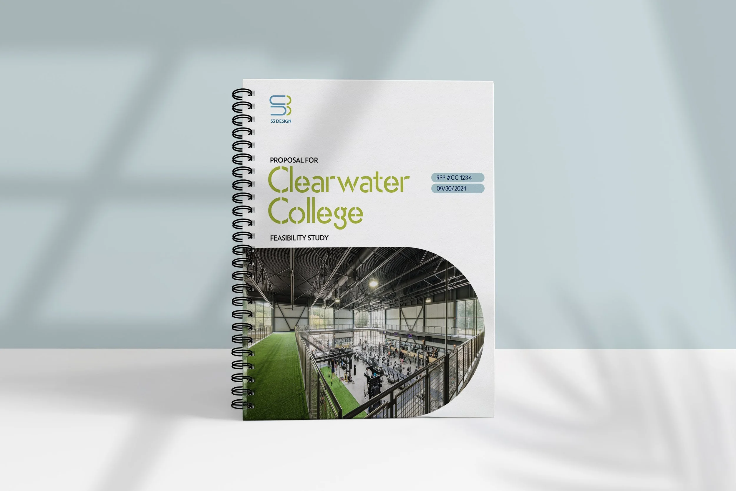
When I helped S3 Design refresh their brand identity, I introduced a horizontal, stadium-shaped image container across marketing materials — for brochures, proposals, and featured images. Over time, when used consistently, this distinctive shape has the potential to become a recognizable brand staple.
When I worked on the Sam Adams Tap Rooms in Boston and Cincinnati during my stint with Bergmeyer, we created both visual and experiential staples that carried across locations: blue-washed wood, copper fixtures, chalk art, and the use of arched typography on signage. As the flagship brand of Boston Beer Company, these elements also made their way into the company’s headquarters.


And with the repositioning of the Baker Chocolate Factory brand, I collaborated with a talented illustrator who created hand-drawn illustrations of the building and neighborhood — to express the craftsmanship and history of the community. Used consistently and repeatedly, those drawings have the potential to become unique brand staples, beyond product photography.

The bottom line
Whatever form your brand staples take — color, type, illustration, shape, or pattern — the goal is the same:
Create consistency. Build recognition. Earn trust.
When everything else changes, your brand staples keep you anchored.
Did you guess all the brand references correctly?1. Tiffany & Co. / 2. Home Depot / 3. IKEA / 4. T-Mobile / 5. Christian Louboutin / 6. Starbucks / 7. Rivian / 8. Coca-Cola / 9. Perrier / 10. Absolut / 11. Pizza Hut / 12. Lowe’s / 13. Burberry / 14. Sephora / 15. Adidas / 16. Jeep / 17. Dunkin’ / 18. Oatly / 19. Chick-fil-A / 20. Nike / 21. Red Bull / 22. Ben & Jerry’s / 23. Morton Salt / 24. ChobaniThat’s all for this edition of Build Mode! If this resonated with you and you think it might help others, feel free to forward it to a colleague. And if you’d like to discuss how to develop your brand staples, get in touch — I’d love to hear from you.
Best.
Kenny Isidoro

What gets repeated gets remembered.
Work zone
I work with business leaders in build mode, those who are ambitious and in a state of growth. If that's you and you're ready to build, there are two ways I can support you.
Brand audit
An analysis of your brand, plus other industry players, with recommendations for increasing its effectiveness in your business.
Discuss your audit.
Custom-built brand
A core service guiding business leaders through a linear process of defining or redefining your brand in four phases: discover, define, develop, and deliver.
Discuss your project.
Subscribe to Build Mode™
a monthly update with brand insights and how they can apply to your practice and your projects. Issues drop on the first of each month. Feel free to unsubscribe if the updates aren't valuable for you. No hard feelings.